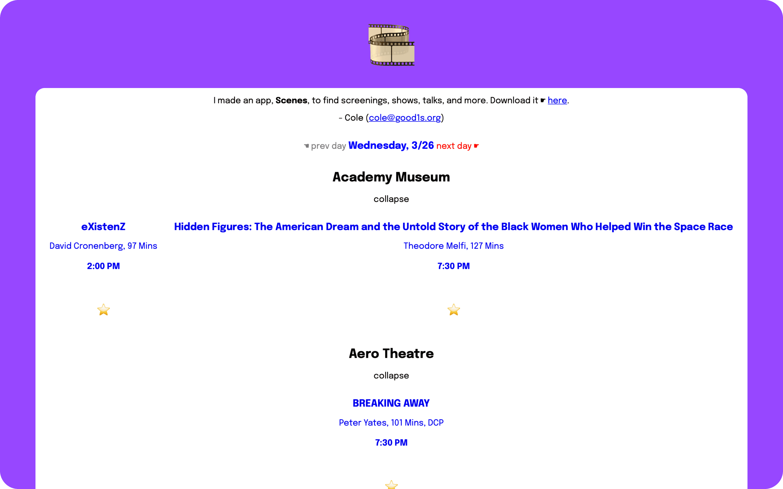
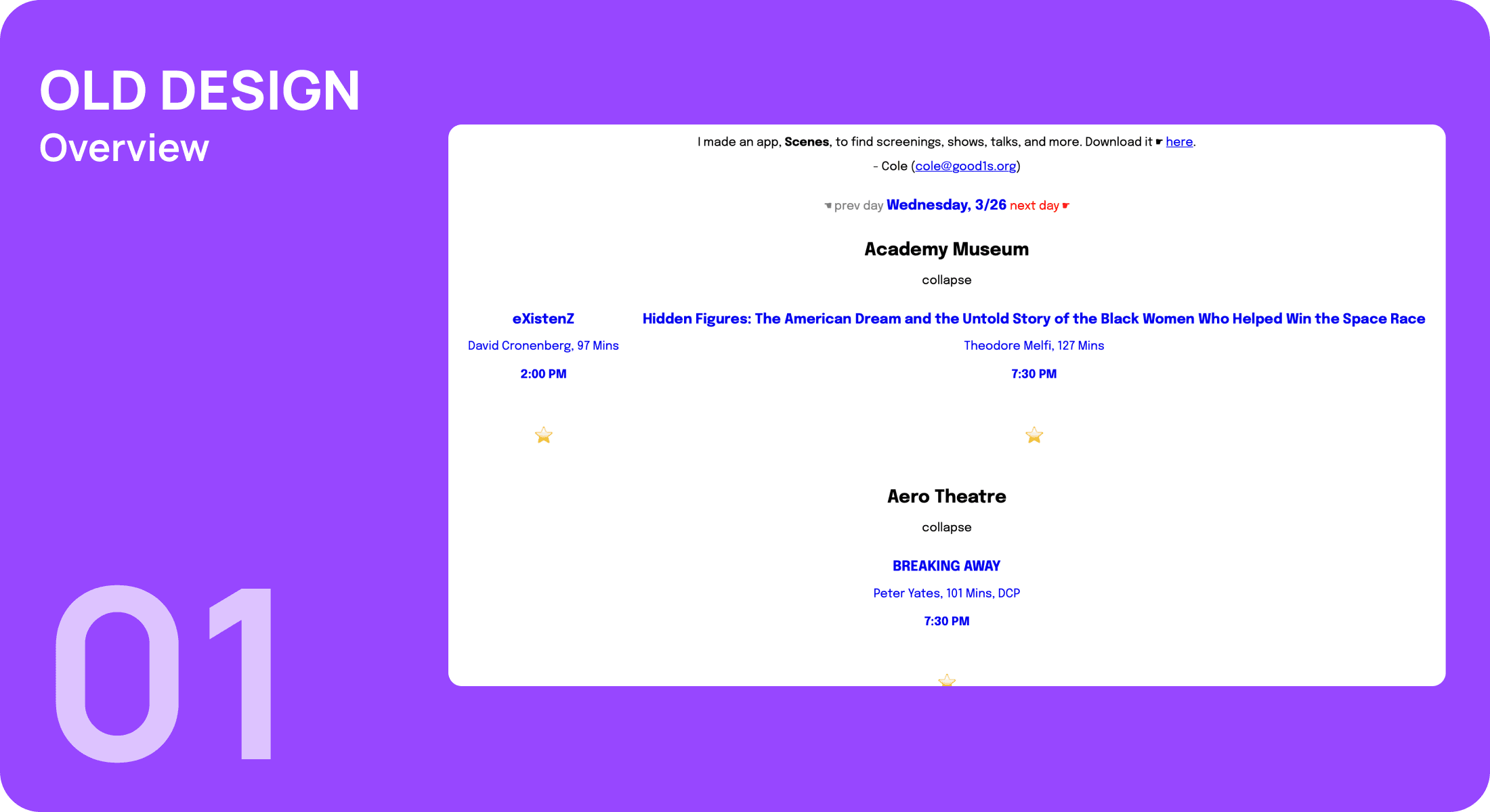
Confusing Layout
The vertical structure lacked hierarchy, making it difficult for users to scan information quickly.
Minimal Visual Cues
While stars and cursors added charm, they felt unprofessional and failed to guide user actions effectively.
Limited Engagement
The lack of intuitive navigation reduced user motivation to interact with the site.
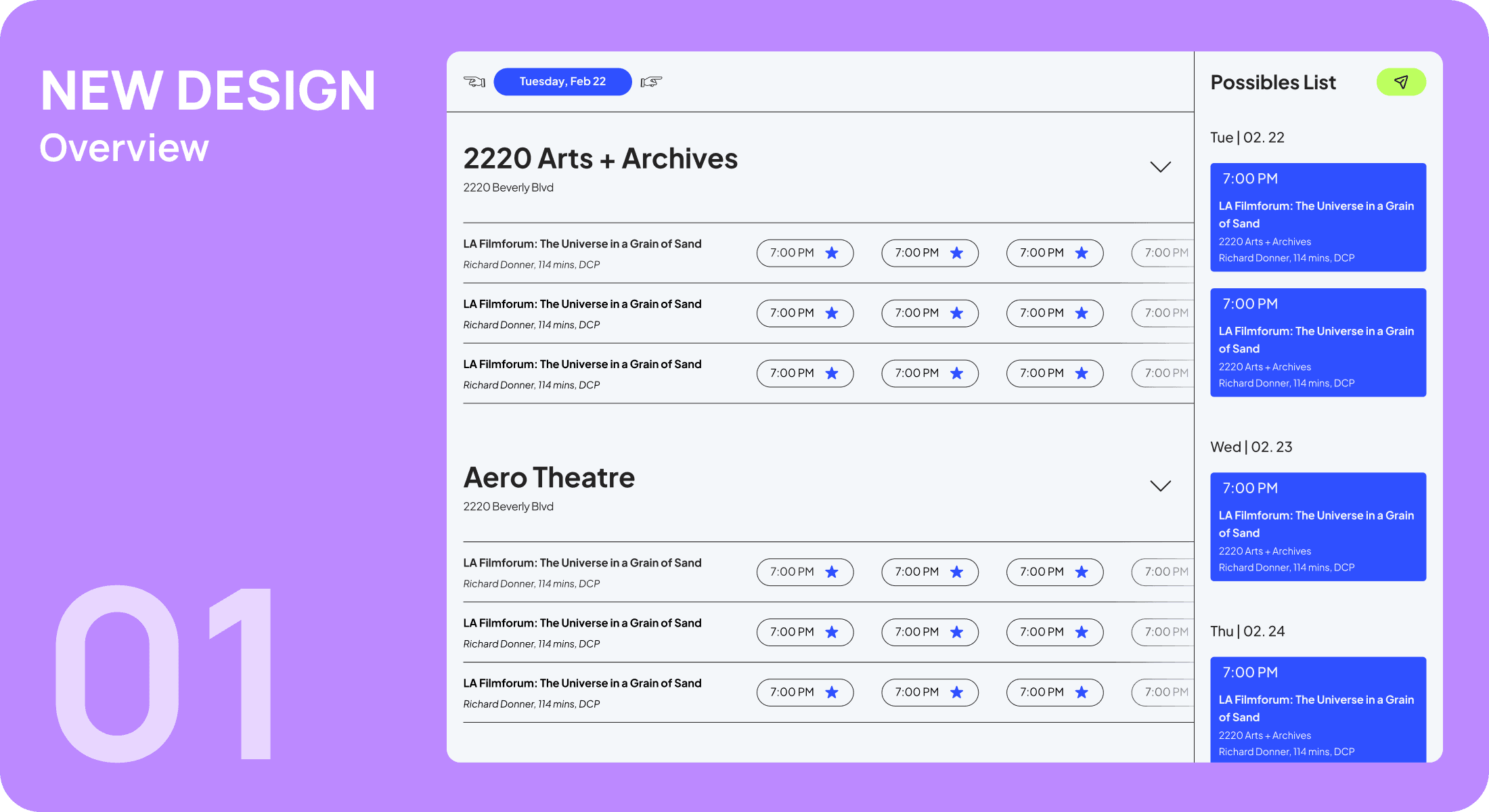
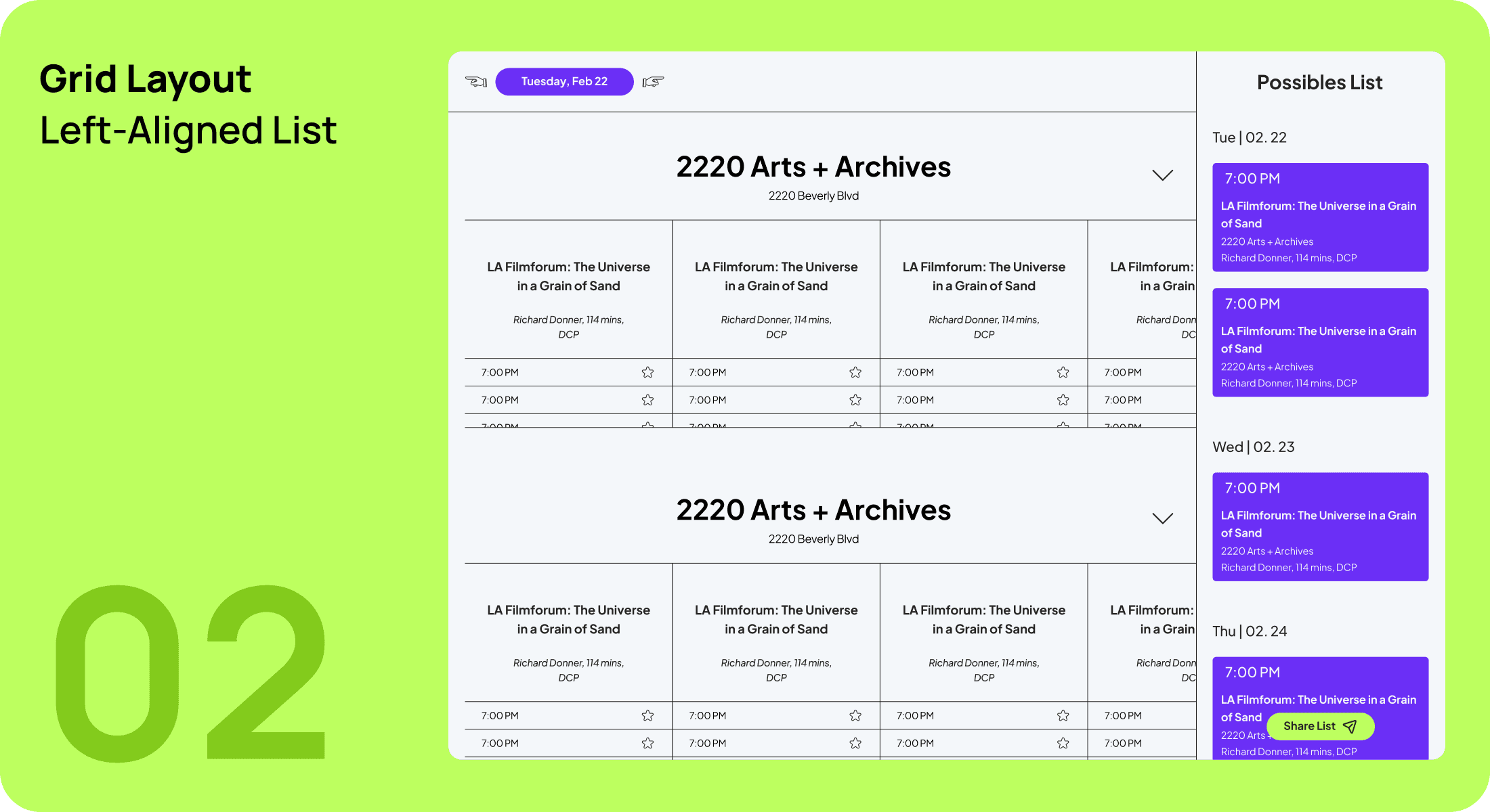
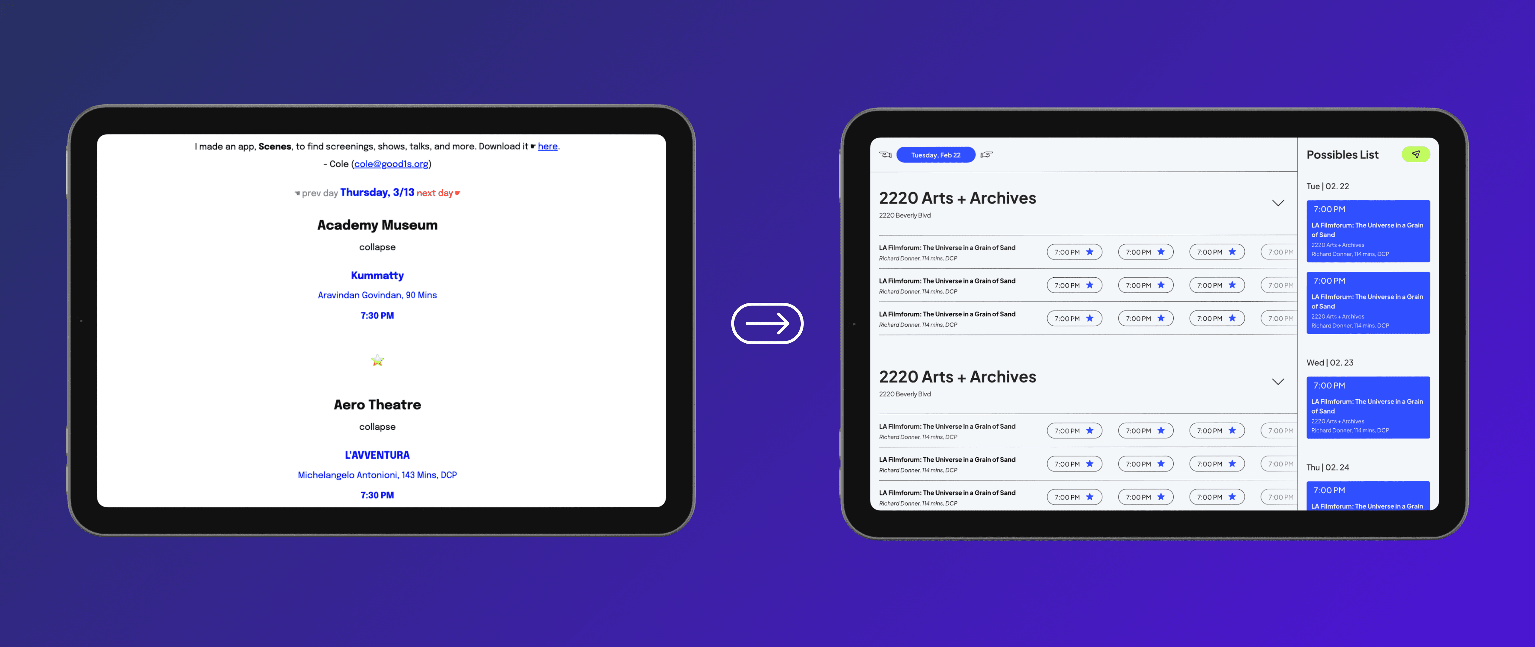
Improved Navigation & Hierarchy
The vertical layout was restructured with clear visual hierarchy and intuitive navigation. Redundant elements were removed to streamline user interactions while retaining signature design elements like stars.
Thoughtful Design Philosophy
Cole emphasized that Good1s should avoid shallow visual elements like movie posters that could lead users to “judge a book by its cover.” Instead, subtle design cues were introduced—such as hover effects and clean spacing—to guide user actions thoughtfully while maintaining authenticity.
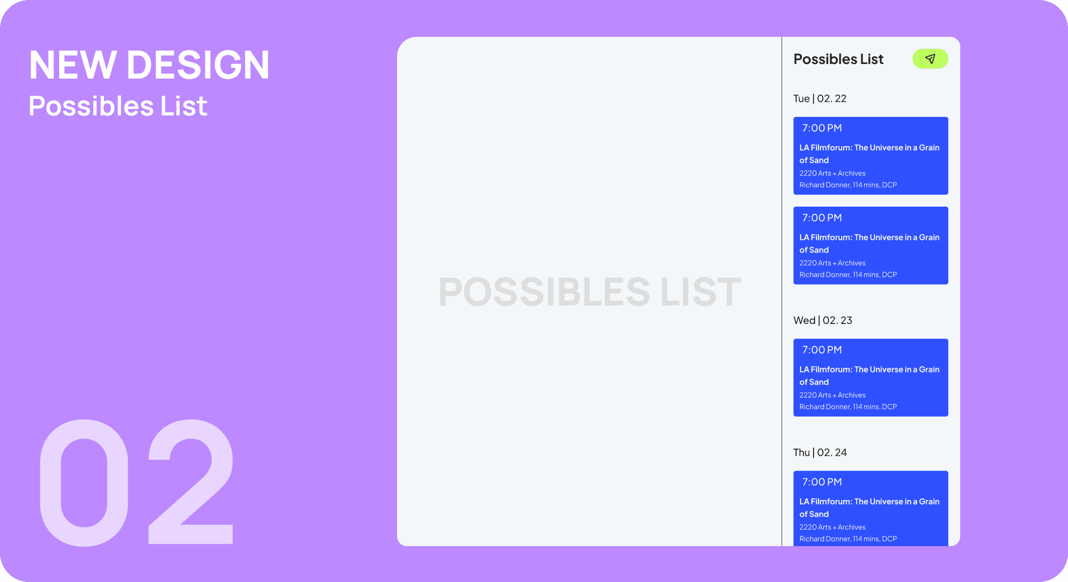
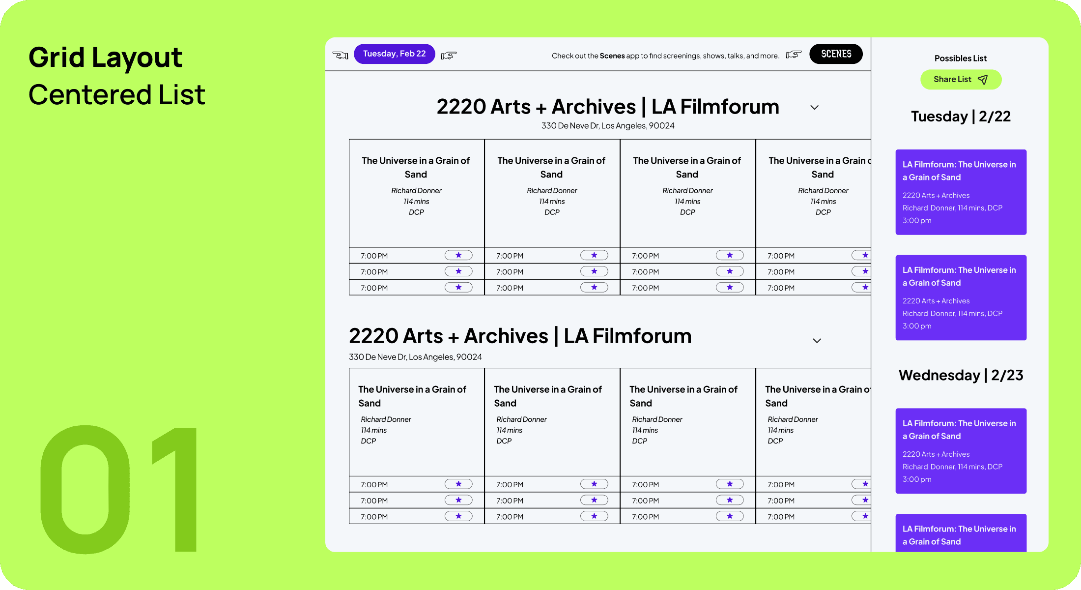
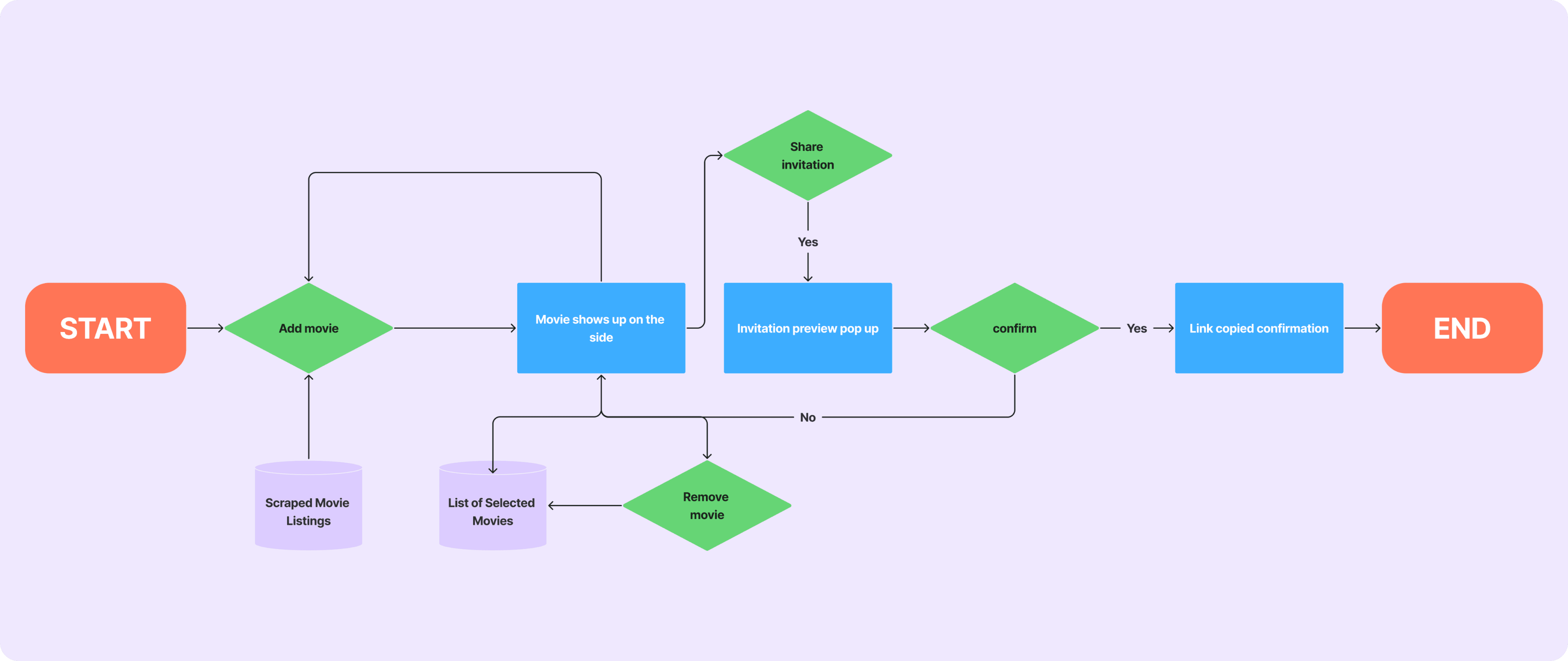
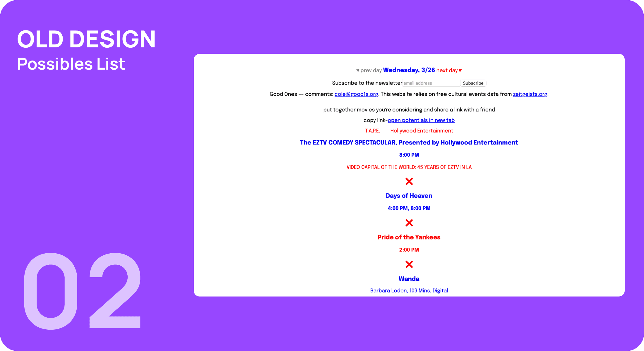
Improved Possibles List
The “Possibles List” feature was revamped into a more intuitive system, similar to an Amazon shopping cart, with movies being organized by date and time.
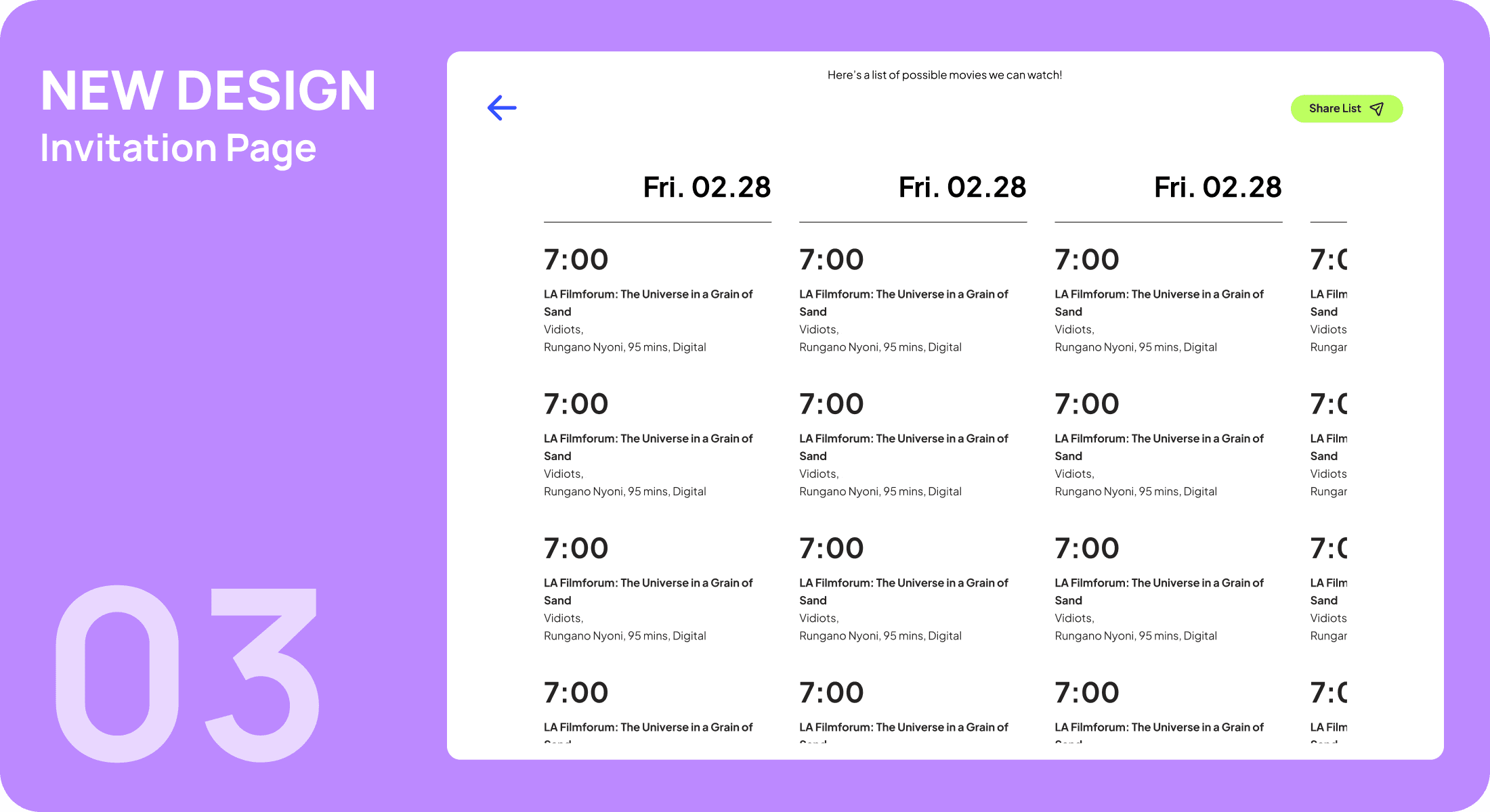
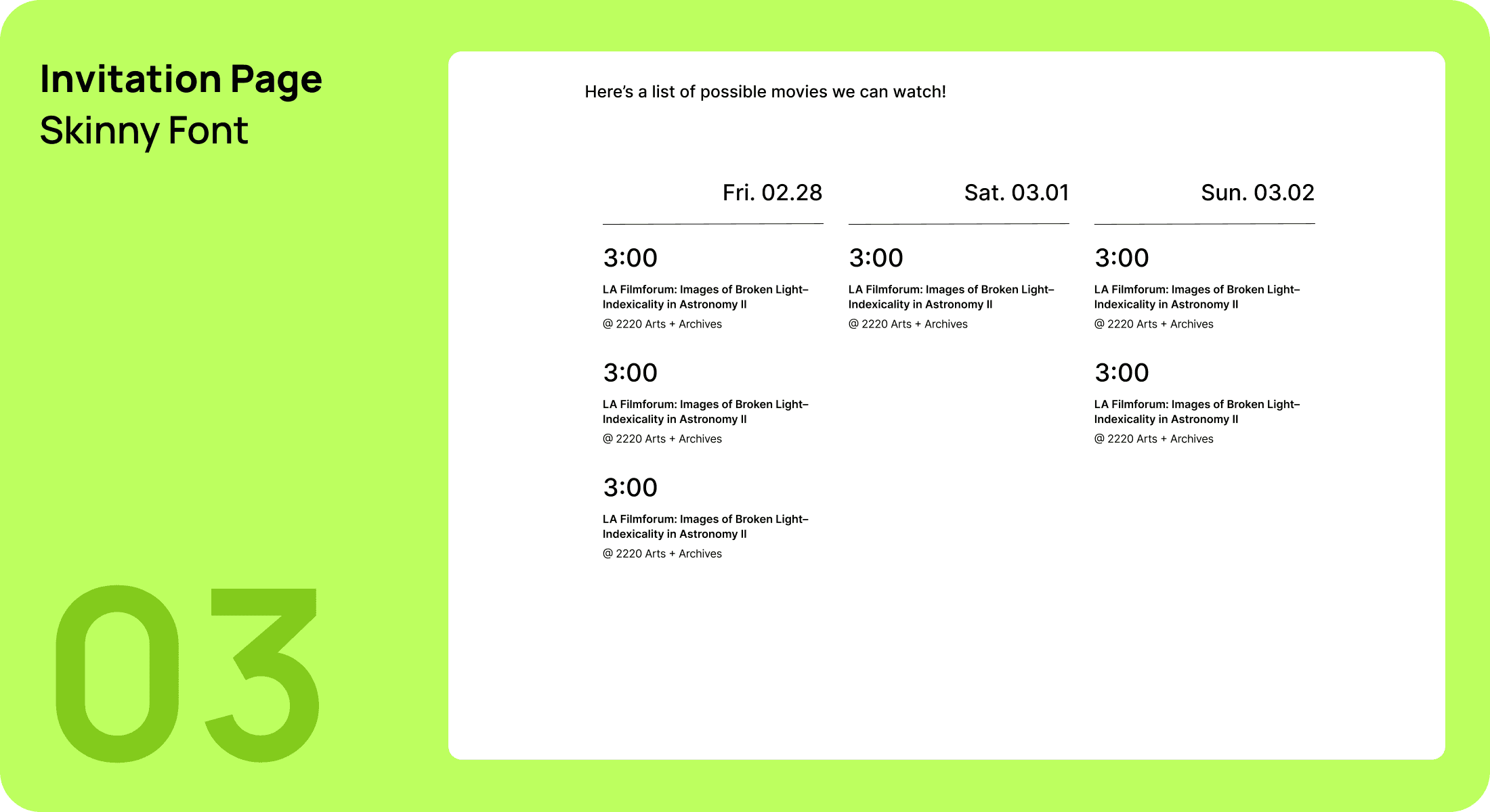
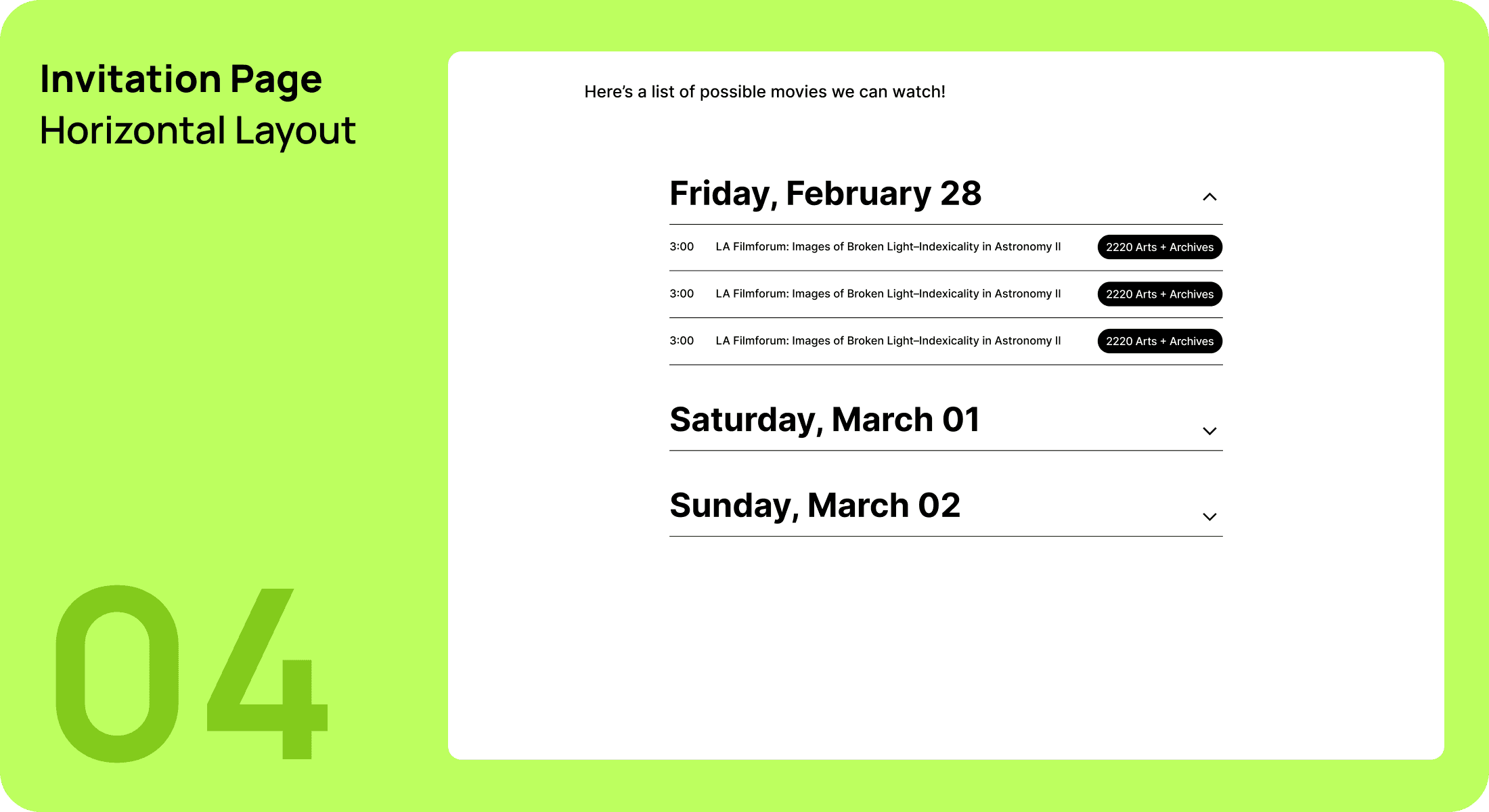
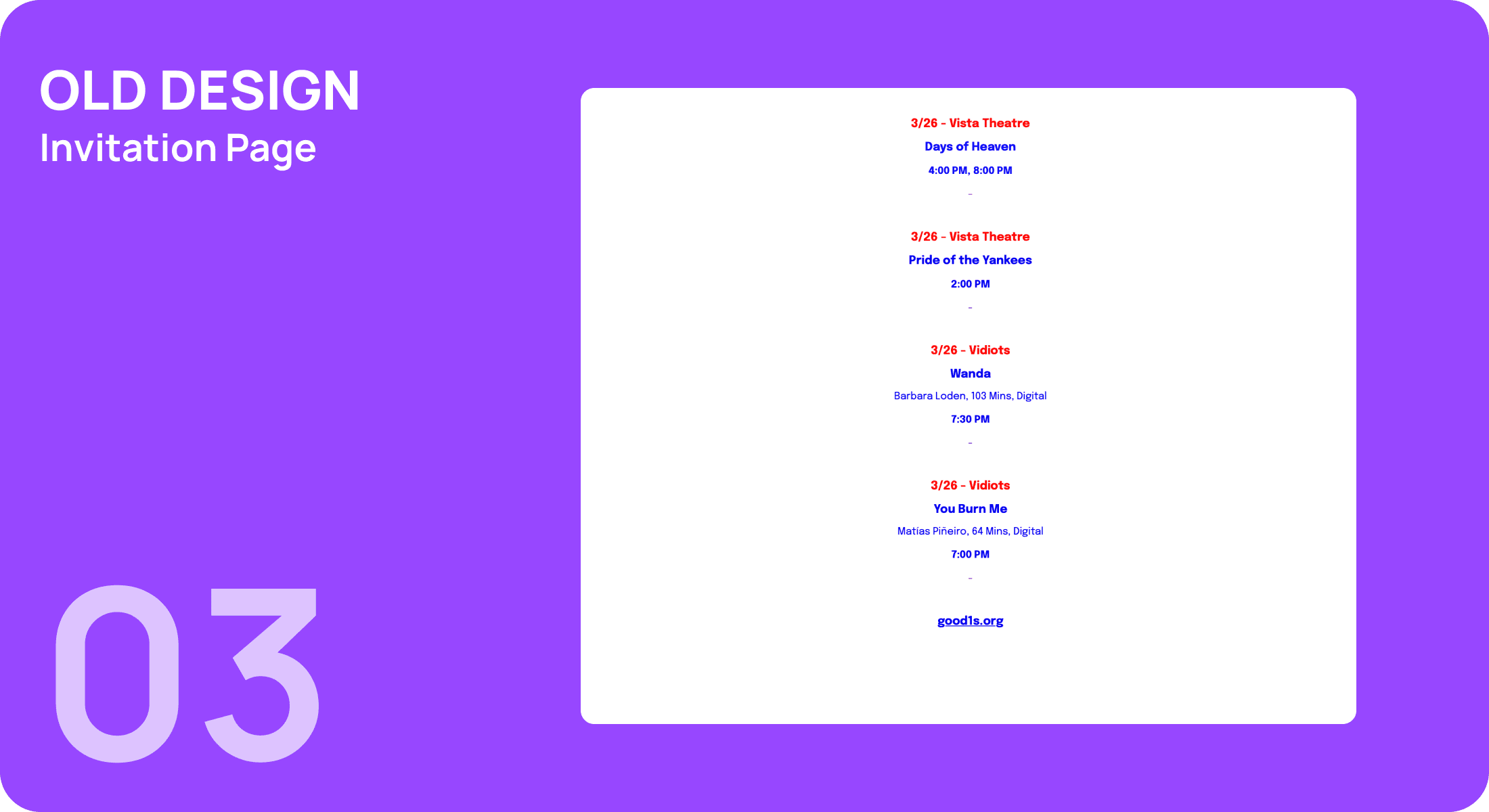
Improved Invitation Page
The new interactive invitation page was created with a better layout to allow users to share their "Possibles List" more easily with friends.